How we redesigned our company brand
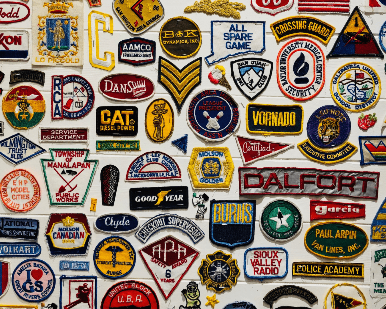
In a small and development-focused company, design and branding often take a back seat to the more pressing issues of the day. When you're busy building software and solving problems, it's easy to overlook the importance of your company's image. But when it was time for us to grow and expand our team, it became clear that our branding needed an update to reflect who we were.
We had a logo that was kind of stuck in the past, and the branding was somewhat non-existent. We used a mishmash of colours, fonts, and icons without any real consistency or guidelines.
This rebranding was my side project — something I chipped away at over a few months in my spare time. It was a chance for me to dive back into design again after a year or so of mainly doing development work. It felt important to get a fair representation of our company now that we were about to hire new people and expand our team. Plus, giving our clients a better impression of us just felt like the right thing to do.
There was no official go-ahead for this project. It was more of a "do it and hope for the best" kind of deal. If it didn't work out, I could just scrap it and move on. But a few years back, I did something similar when I put together a marketing website for Survey Generator and that turned out pretty great. So, I figured I'd give it a shot. I was ready for people to maybe not like my ideas, but sometimes it's better to ask for forgiveness than permission.
So, what's new? Well, we got a new logo, fresh brand colours, and a shiny new website. The website isn't huge or anything, and most of our business comes through word-of-mouth rather than people randomly finding us online. But still, it's important to look good. First impressions and all that.
Why the change was needed
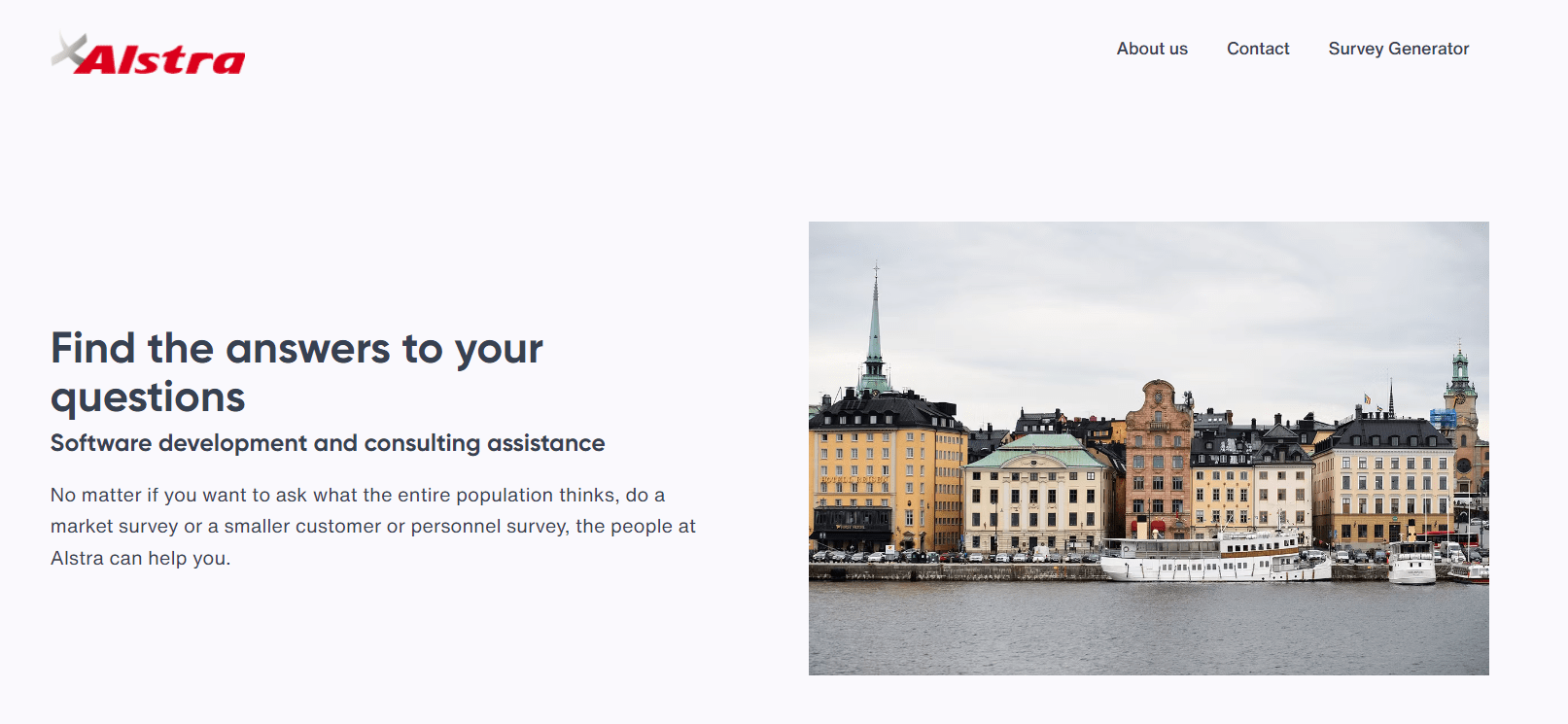
When I first looked at our existing logo, several key issues stood out that needed addressing:
- Lack of vector format: Our logo only existed in a PNG format. This was a significant drawback because it lacked the clarity and flexibility of a vector. Scaling it up always resulted in a loss of quality, making it look less sharp and professional.
- Absence of brand guidelines: There were no clear guidelines on how to use the logo. This often led to inconsistency across different mediums, diluting brand recognition and professionalism.
- Colour imbalance: The logo predominantly featured red, which, in excess, can be overpowering. While red is an strong colour, a more balanced palette was necessary to convey our brand's identity more effectively.
- Outdated design: The overall look of the logo felt outdated and didn't mirror the innovative spirit of our team. It was important to have a brand image that resonated with our current stature and vision rather than one that reflected an older era.
These factors combined made it clear that a change wasn't just a nice-to-have. We needed a brand identity that could genuinely represent who we are as a company.
Planning and research
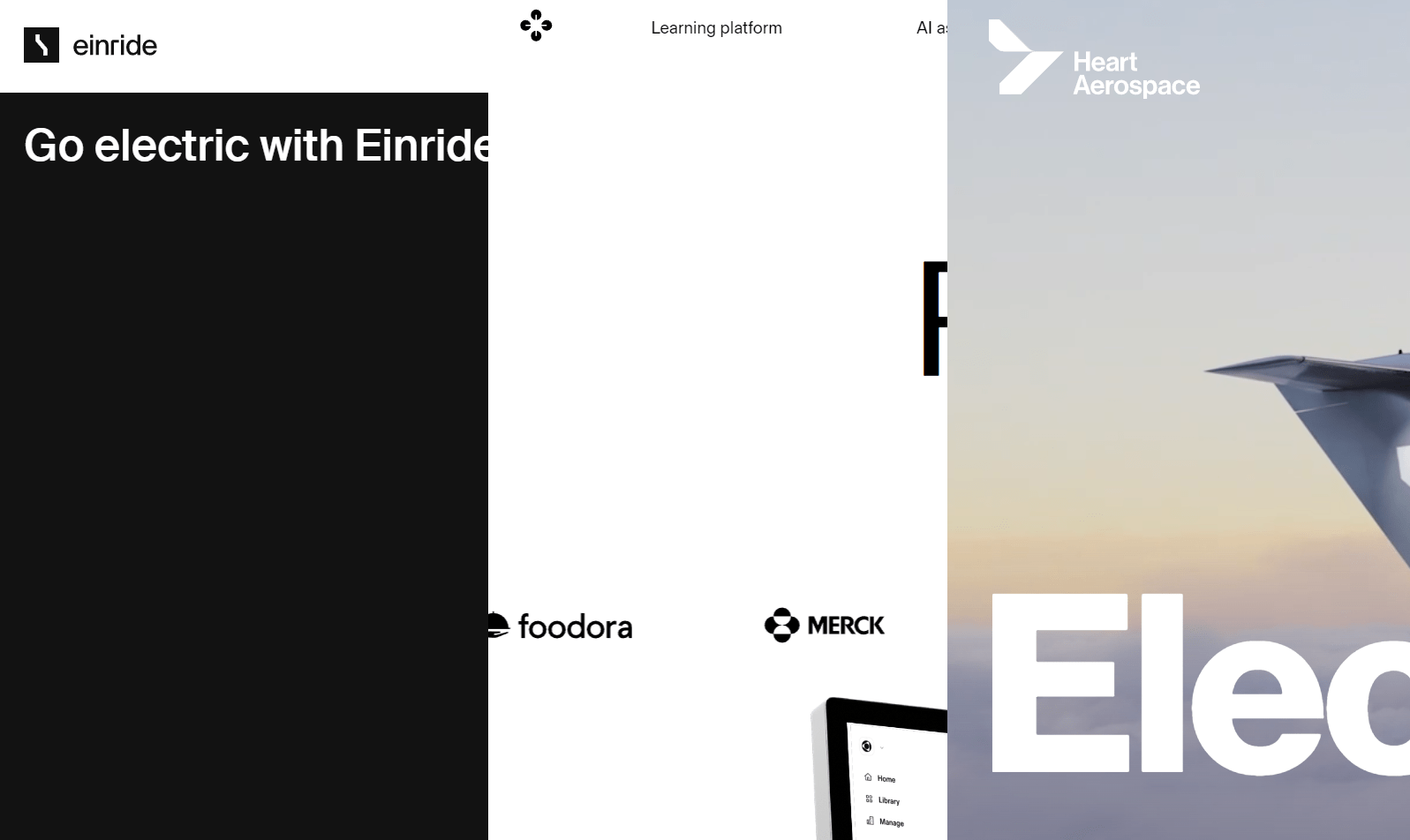
I started by exploring the branding of other tech companies across Scandinavia. This wasn't about mimicking what others were doing but about understanding the visual language of our industry. In the tech world, especially in our region, there's a certain aesthetic that conveys professionalism and trustworthiness. It's like putting on the right outfit for an interview - you want to fit in but also stand out for the right reasons.
Think of it this way: you wouldn't expect a tech company to sport a logo like KFC's, right? It's not just about being different; it's about being relevant and appropriate. So, I delved into the branding trends in our sector, looking for inspiration and understanding what resonates with our audience.
This research phase was about gathering ideas and elements that could be woven into our own brand identity. I was looking for colour schemes, typography, logo styles - anything that could be adapted to suit our identity. The goal was to strike a balance between standing out in the market and maintaining a connection to the industry we're a part of.
I eventually zeroed in on companies like Heart Aerospace, Einride and Sana Labs, which use a combination of black and white in their branding. This is a common theme across the industry, and it felt like a good starting point for our own brand identity.
The design process
Choosing the logo style
We decided on a wordmark logo where the company name is the logo. The goal was to keep it straightforward and let the name speak for itself, avoiding any overcomplication with elaborate symbols. Next to the name, we added a distinctive underline to give the logo a bit of character. For us, the underline symbolizes the essence of software development. In the early days of programming, an underline often indicated where you were about to start typing - marking the beginning of creation or building. In Swedish, 'Alstra' translates to 'to create' or 'to build' - this design choice serves as a nod to that foundational creation process, reflecting our roots and what we do.
The colour palette

The original logo was predominantly red, a colour often linked with urgency or caution. We decided to move away from this association and opt for a more neutral palette that felt modern and professional. The new logo features black text #000000 for a bold, clean look, complemented by a white background #FFFFFF for a minimalist feel.
We embraced the same minimalist palette for broader branding and the website as well. This ensures ease of maintenance and offers a clean, professional look that's easy on the eyes. The black-and-white combination is timeless and versatile, delivering a sense of sophistication and modernity.
Typography
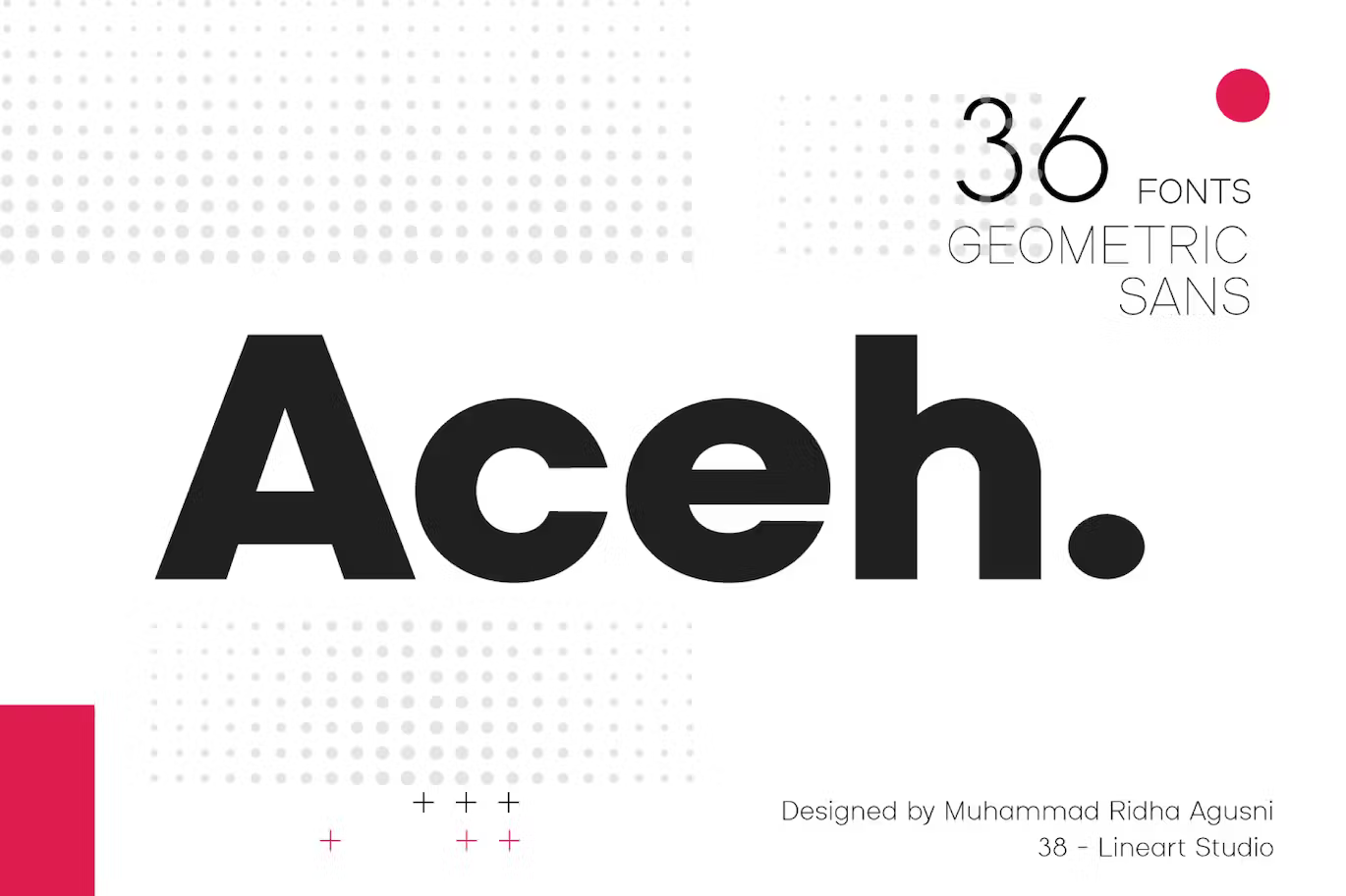
I was looking for something battle-tested and reliable but not overly common. With its geometric design and sharp strokes, Futura initially came to mind. It's a classic font that's been around for almost a century and is still widely used today by companies like PayPal, FedEx, and Red Bull. However, I sought a font that was similar yet distinct. After some searching, I found Aceh, a font with the same geometric clarity and sharpness as Futura but with a more modern feel. It's a font that's not too common but still feels familiar.
The result
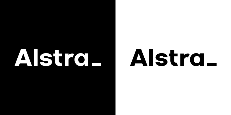
The response from the team was overwhelmingly positive. It resonated well with everyone, and they appreciated the thought process behind it. For me, one of the biggest wins was seeing how the team rallied around the new design. I felt that it was important everyone felt a sense of pride in our brand, and the positive response was a testament to that. Seeing everyone come together and embrace the new design was a great feeling.
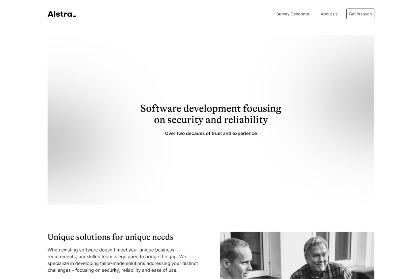
Admittedly, I was concerned about how the shift from our old branding would be received. A strong sense of sentimentality is often attached to a company's branding. However, we struck the right balance by preserving elements of our legacy in the new branding. This approach helped ease the transition, providing a sense of continuity while moving us in a more modern direction.
The rebrand really made us look more professional. It's not just about the logo or the website; it's about the overall impression we give the outside world. It's about showing that we're a company that cares about the details and takes pride in what we do. We still have some work to do, like updating the pictures on the website and refining the content, but the foundation is there.
As we move forward, I'm excited to see the future results of this rebrand. It's a new chapter for us, and I'm looking forward to seeing where it takes us.